Letterpress Typesetting
- Aug 10, 2022
- 1 min read
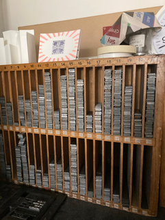
After my last feedback session, Marco suggested I use letterpress instead of calligraphy. I feel like letterpress is also a good option to provide individual attention to each letter and word. While working on the illustrations, I simultaneously worked on setting the type for the scroll. While drawing the scroll the reason I switched to Perpetua was that we have Perpetua the font in a big enough type size. At first, I was planning on using 48, but it turned out to be too big, so I went with font size 24. For the leading, I had to improvise as there wasn't enough 3-point leading. For the spacers, I used thinner spacers than available with the font as Perpetua is a thin font. There weren't enough spacers so I used some from Gill Sans 24. For the [], I could not find any for Perpetua so I used another font.
After doing a test print I circled all the mistakes and fixed them all using a tweezer. This is my first time working with letterpress so the whole thing was a big learning experience. From rolling the ink to applying the right amount of it to the type, setting the type and spacing it as well as justifying it. Most of my text is centred so I had to centre it all which is more complicated than left or right-aligned text.


Comments