Starting the brief
- Oct 26, 2021
- 5 min read
Updated: Aug 12, 2023
Hey folks! Welcome to my personal research blog, where I'm taking you along for the ride through my master's course in graphic design. This time, we're diving into the fascinating world of publication briefs – the stuff that's keeping me busy this semester. So, grab your metaphorical popcorn and join me on this exciting journey of creative exploration.

This Publication brief is the second one we're supposed to work on for this semester.

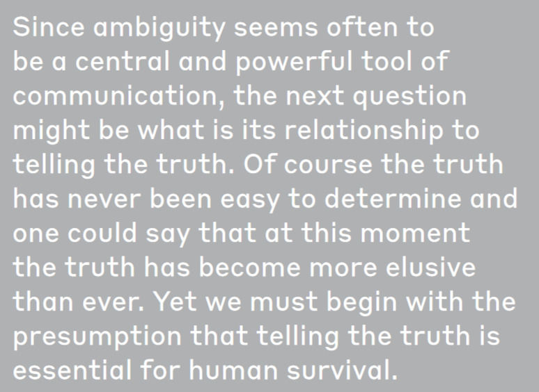
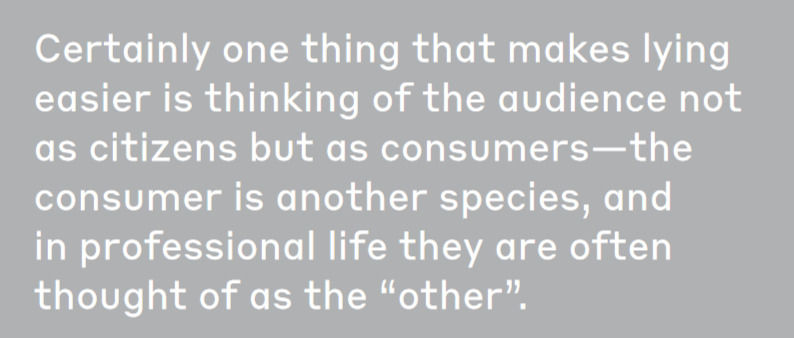
For the first week, we went over publication design in general, and its components, and we started to think about the text provided for the brief, 'Ambiguity & Truth' by Milton Glazer. Anyways, not to get too ahead of oneself, let's first start with editorial design. According to the lecture, there are a few keywords, and these keywords are areas we focus on to create a cohesive and comprehensive design. A text is not just the words used to form it, its presentation adds meaning.
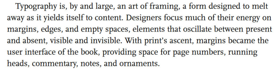
The concepts and methods for analyzing the meaning behind typography is left behind by the techniques developed for the analysis of written content. Typography is the art of using type, the visual component of the written word. When a written text is presented in a particular typeface or script, that is known as a font. A font is the complete set of characters in a particular style. This typeface or font is the medium by which text is presented to the audience. Typography was initially concerned mainly with legibility and was not considered a source for semiotics. (Van Leeuwen, 2006)
Traditional fonts imitated handwriting and were not meant to provide any additional
meaning, simply seen as a mechanism of delivery. Many considered typography to be
subservient to the text, expressing the need for it to be invisible to the audience. Bringhurst
(1992), Goldenberg (1993) and Kerper (2002) in particular were of the strong opinion that any
narrative should be judged by the storytelling and not the representation of text. However, that has since changed and typographical elements are not part of the narrative, providing an additional conduit for the audience to draw on for more information.
As Hill (2005) said, the digital era gave new life into the type industry. Creating and
manipulating fonts were no longer limited to the typesetter, rather anyone with a computer could try their hand at it. This simplicity and ability to see how the type looked allowed designers and typesetters to get to a new stage. Lupton (2010) wrote, “Typefaces are an essential resource employed by graphic designers, just as glass, stone, steel, and countless other materials are employed by architects”. Different fonts have different associations due to their shapes and forms and thus different meanings. The plethora of typefaces available has allowed designers to become creators of type for use in multimodal contexts. This changed typography from something that was once an invisible means of communication to a visible means for communication.
Then here, we must consider that editorial/publication design has much more to consider. Establishing that typography is important and communicates just as much as a text, an editorial design that is the culmination of typography, and other important aspects - goes to show just how much space there is for creativity and innovation. Additionally, the editorial design goes towards newspapers and other similar texts, whereas publication design deals with books and other published texts, though it is loosely defined as of yet.
As this is my first time researching and working on graphic design in an academic setting, the posts on this blog might delve further into the basics, and sometimes stray in its experimentation. Please note that this is all written with my understanding.
Concept

'Thinking with Type' is obviously focused on typography, but the essence of it stands. What is your concept? What is the very basic keyword you would use to describe your design?

Ms Lupton gives designers some free advice, and I felt that it supplemented this point.

The side note is very interesting to me.
Narrative
The narrative is important. That sounds almost obvious, and it is in some ways, it goes without saying. Design, art, text - it all has a narrative. It's telling a story. How persuasive the end product is, depends on how well we communicate the narrative as designers. I don't think it's limited to make it clean and legible. I think we take leaps forward. As I wrote in the beginning, everything about the publication says something. The font, the space, the grid - all of it tells a story, and as designers, it's up to us to make sure that the narrative of the text is enriched by the narrative of the design.

Sequence
Sequenceeeee. The order in which things are done, shown, read, written, etc.

I love that last line because it hints that your text and the sequence in which you present it need not be rigid unless that is the best way for it to be read.


Tempo
The speed, the rhythm in your design. Does it give you room to breathe? Is it incessant and unrelenting? Does it take a loooong pause, or is it so in your face you can't look away? All things to consider.
Navigation

Genre
The Genre that the text belongs to, that your design will belong in is important not just because it shows you how other designers and artists have worked on similar text, but because then we can truly start to do something new, or even honour the past and use it to communicate, with all of its connotative glory.
Typography


Image
Whether to use images, photographs or illustrations and how to use them. Does it help your design or hinder it?
Tension

Scale


Structure
Ah yes, the reason why everything you read on the web either looks terrible or informative. That sounds like an exaggeration, but here, let me give it a shot. Let's say you're writing a dissertation, you slept over the entire year and it's due in two weeks. You need information, you need research. Google gives you two comprehensive websites, one is ordered and labelled. All articles, papers and books have tags and you can search comprehensively to find exactly what you need. The other, has just as much material, if not more. However, it doesn't have a search bar, it's simply a long website with links to the online versions of whatever publication they have, ordered alphabetically. It's still useful if you know exactly what you want, but it's hardly persuasive and unless you absolutely need to, I doubt many would use a website like that.
Space

Contrast

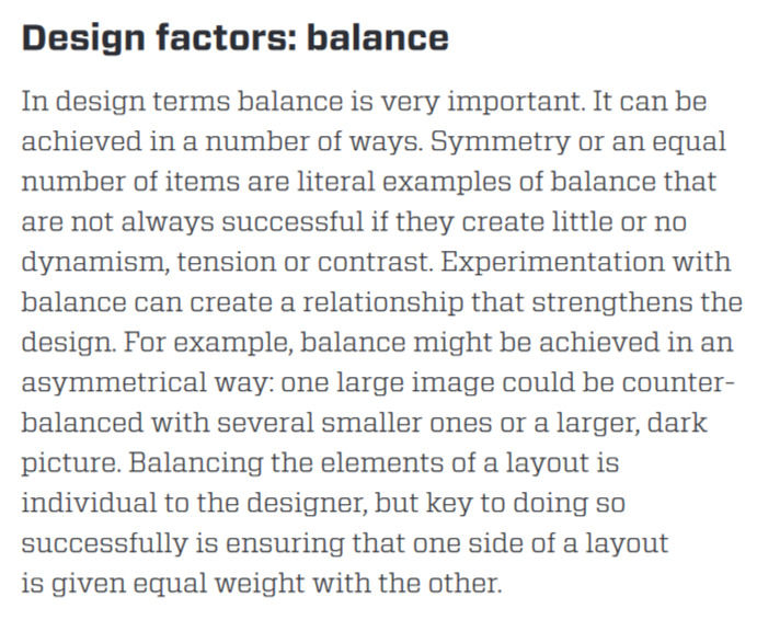
Balance
And finally, about this particular essay.

Alright, that's a wrap on this intro. But stay tuned, because next week we're diving deep into 'Ambiguity & Truth.' We're gonna break it down, analyze it, and maybe even give it a little shake. So, stick around, stay curious, and let's keep this design adventure going! 🚀


Comments